PowerPoint Path Animation

I wonder how often you make an animation. Maybe not so frequently or not consciously. How about PowerPoint or a similar presentation software?

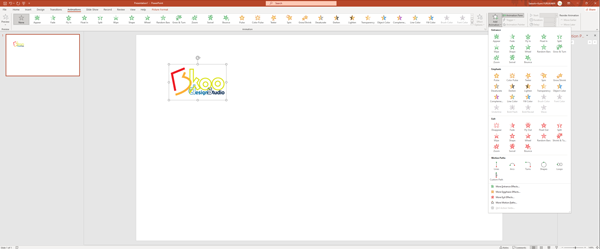
PowerPoint has a set of pre-made animations, and you can apply to a text or image. I think people are pretty familiar to apply these animations.<br> <b>How about “Path Animation”?Perhaps you don’t use it so regularly, but it’s sometimes very effective. One tip that I recommend who is not familiar with the Path Animation, it’s better to choose “ARCS” instead of “LINES”, because A “LINE” has only a start and an end point, no point in between and you cannot add another editing point later. So you cannot edit the path shape later.

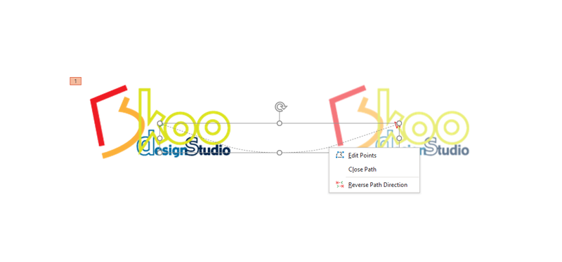
Once you select an image or text box, apply “ARCS” path, it plays automatically once. Then Right-Click and select “Edit Points” to edit the path.

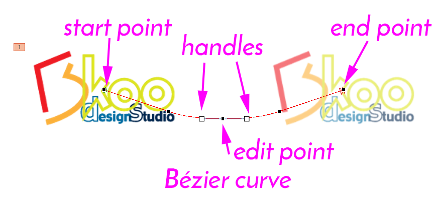
The path is called a “Bézier curve“. You can edit the curvature with the selected edit point to move around and use handles’ both side to control the curvature tangent(direction).

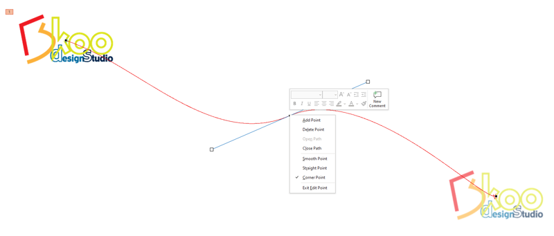
You can add or delete an edit point for the path until you are satisfied the flow.

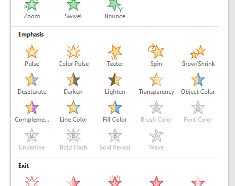
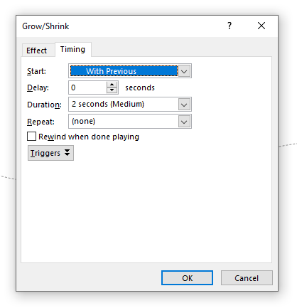
Also, if you add another animation preset such as “Grow/Shrink”, then set the “Timing” to “Start [with previous]”.

You can animate the path Move(Transition) and Grow/Shrink at the same time.

Sometimes too much animation will destroy the entire presentation, so use animation efficiently.

Enjoy!

THIS VIDEO in YOUTUBE: https://youtu.be/36R1Ak–51c

SVG (scalable vector graphic) animation

<svg viewBox="0 0 100 100" xmlns="http://www.w3.org/2000/svg">
  <rect x=0 y=0 width=100 height=100 fill="black" />
  <circle cx="20" cy="20" r="20" fill="red" />
</svg>

SVG animation with SMIL

<svg viewBox="0 0 100 100" xmlns="http://www.w3.org/2000/svg">
<rect x="0" y="0" width="100" height="100" fill="black"></rect>
  <circle cx="20" cy="30" r="20" fill="red">
    <animate attributeName="cx" from="0" to="100" dur="2s" repeatCount="indefinite"></animate>
    <animate attributeName="cy" from="30" to="100" dur="2s" repeatCount="indefinite"></animate>
</circle>
</svg>

You can use Javascript to manipulate element

var svg = document.getElementById('IDNAME');

and/or CSS

@keyframes

<style>
.wrapper{
height:400px;
width: 400px;
background:#111;
text-align: center;
overflow: hidden;
}
.svg-wrapper {
  height: 60px;
  margin: 0 auto;
  position: relative;
  top: 50%;
  transform: translateY(-50%);
  width: 320px;
}

.shape {
  fill: transparent;
  stroke-dasharray: 140 540;
  stroke-dashoffset: -474;
  stroke-width: 8px;
  stroke: #19f6e8;
}

.text {
  color: #fff;
  font-family: Arial, Helvetica, sans-serif;
  font-size: 22px;
  letter-spacing: 8px;
  line-height: 32px;
  position: relative;
  top: -48px;
}

@keyframes draw {
  0% {
    stroke-dasharray: 140 540;
    stroke-dashoffset: -474;
    stroke-width: 8px;
  }
  100% {
    stroke-dasharray: 760;
    stroke-dashoffset: 0;
    stroke-width: 8px;
  }
}

.svg-wrapper:hover .shape {
  -webkit-animation: 0.5s draw linear forwards;
  animation: 0.5s draw linear forwards;
}
</style>
<div class="wrapper">
<div class="svg-wrapper">
  <svg height="50" width="320" xmlns="http://www.w3.org/2000/svg">
    <rect class="shape" height="60" width="320" />
  </svg>
   <div class="text">HOVER</div>
</div>
</div>
HOVER